I think type design should be a mixture of intuition and calculation.

Lucas de Groot interview
Lucasfonts, 2008
Why did you become a type designer ?
To fulfil a need for type :-). Someone had written the page numbers in the school newspaper by hand. I found that very ugly and I wanted to do something about it. It’s been like that ever since.
You’re Dutch but work in Potsdam/Berlin. Why this expatriation ?
I had worked in Amsterdam for four years. At that point I was looking for a new challenge – I thought Amsterdam was too small. Erik Spiekermann offered me a job at MetaDesign. I was single, so I went for it. Four years later I had a teaching position and I began receiving great assignments outside the agency. So I had to make myself independent, and started my own company. Although I visit my relatives in the Netherlands quite often, I never felt a need to move back. And my bilingual son (8) likes his German school 🙂
You are the author of an interpolation theory and more generally seem to have a scientific approach of type design. Is there still any place for artistic instinct or spontaneity ?
Sure, look at my calligraphy and illustrations. I think type design should be a mixture of intuition and calculation. If it becomes purely rational, you get fonts that look unhealthy and unfriendly.
When you have to convince a non-specialist, what are the main arguments for you to convince him/her to choose TheSans ?
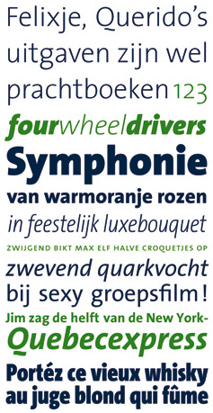
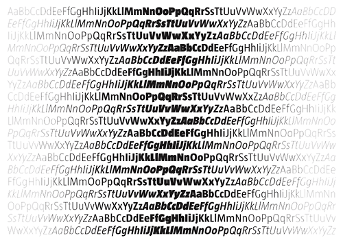
It’s humanistic, it has a friendly touch, great italics, many weights, widths, lots of typographic goodies, etc. But in the end it’s a matter of taste, so I wouldn’t insist too much in trying to convince anyone.
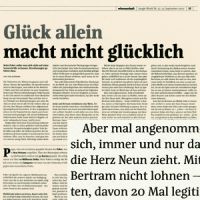
Your typefaces are widely used in newspapers. Do you have a special insterest for the typographic specificities of these customers ?
I like to find ways of meeting technical constraints, and to solve visual problems through type design. Newspapers offer many such challenges: the printing process is less precise than sheet offset, the paper is often coarser; also, the design process offers little time for deliberation or subtleties, so the type must do part of the work.
The first real type design I completed was for a newspaper (Folha de S. Paulo), later I designed fonts for Taz, Der Spiegel, Le Monde, Jungle World, Metro. I enjoyed working in close collaboration with the art directors and designers of those papers. For instance, the Danish designer of Metro had very particular demands for the headline typeface. I gave him access to the Multiple Master technology which is used as a design tool in my studio, which he could then use to specify the weight, width and amount of contrast. The family was generated according to these specifications, and expanded for Russian, Bulgarian and Greek.
Now that you have created one of the most succesful typeface of these last 20 years, what can be the typographic challenges which motivates you to continue in the type design area ?
Solving communication problems, making things better than they were.
On your site you propose a trailer of your TheSans. Do you think the web has changed the way a typeface is marketed ?
Sure. Less print, less ink, less stamps, less delay, more gifs tifs jpgs pdfs pngs swfs. And of course, access to high quality type with just a few mouse clicks.
Last small question: why “Luc(as)” ?
My full name is Lucas Adrianus Wilhelmus de Groot, my calling name is Luc (officially printed on my birth announcement!). When I was young, some people called me Luc, others Lucas. I wasn’t aware of the difference until I had to design my business card in school, then I came with this solution: Luc(as).
- Related article: Corpid typeface portrait (2008)
- Credit: Lucas photo by Franziska Toerring
